Sorry, I don't have a portfolio ready to go yet. Here's something I threw together with some sketches that I made a while back. I'm afraid that it's a little outdated, though I feel that it's a problem that still hasn't been adequately solved.
A people-focused mobile notifications experience
I want my phone to be a very personal device for communicating with friends, not for "engaging with brands" and apps. Cynicism aside, smartphone designs today put apps first, not people. Previous versions of Windows Phone had a more human-focused design than other platforms, but that regressed somewhat in Windows 10, and I'd like to see my phone treat people with the upmost importance.
One of the most glaring problems for me today is that the lock screen tells me nothing about who is trying to reach me—but other than perhaps the time, that's the most important detail I need to know as soon as I pick up the phone. I've been exploring some ideas on how that can be improved.
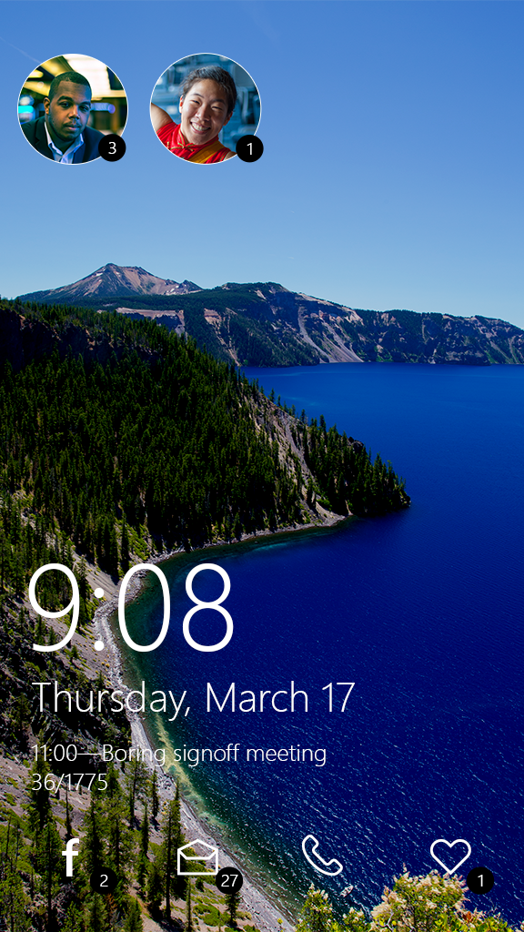
This design stays true to the existing Windows lock screen: bold typography, and notifications from your select favorite apps at a glance. I kept the lower-left alignment of the time and date, as I feel that it's the best possible location for that information—other platforms tend to place the time at the top center of the screen, but that's often the most important part of an image you might want to use as a wallpaper, such as a photo of a loved one.
Focus on people
The primary difference between this design and what exists today is of course the colorful photos of the friends who are trying to reach you. In the same way that Caller ID lets you easily screen your calls to decide if it's worth picking up the phone for Mom or calling her back later, this design lets you immediately decide if you want to read that message from Scott right now, or if you're not going to bother reading that text from Alexa until later when you're not as busy. It's not necessary to pull down the notification shade and dig through a list of stuff you probably don't care about.
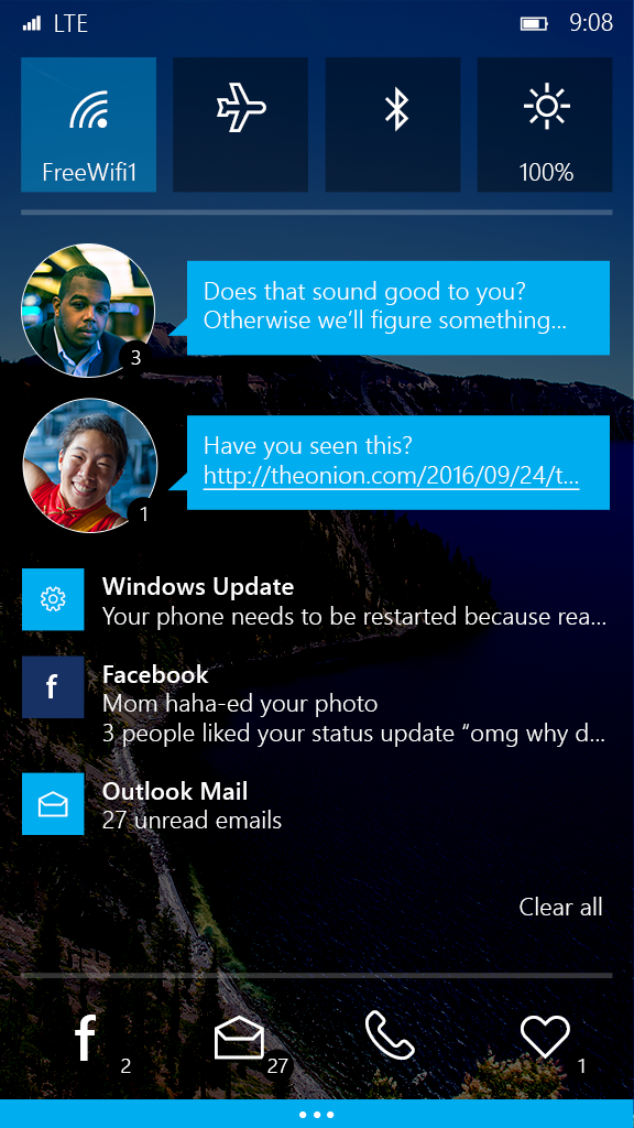
When the notification shade is pulled down, you can see the first unread message from each of your friends in a familiar text bubble. (Like today, some users may want to only show this if the phone is unlocked, preferring to just see a row of faces.)
The app doesn't matter
Most notable is that the message notifications don't show me which app they're from. I just want to see who messaged me, and an idea of what the conversation is about. That the message came via SMS or Facebook is largely irrelevant, and distracts from the most important part: people! Windows's horrendous built-in People app already supports merging contacts from a variety of sources—it's time to extend this to notifications.
When the phone is unlocked, I'd also like to see an option for adding a background image to the notification shade, whether it's reusing the image from the lock screen, or adding a new type of wallpaper entirely. I'm all about adding splashes of customization and color to make my devices truly mine.
Not just for phones
This isn't just a phone feature either. Desktop PCs and tablets could also use a greater focus on people, though the most useful way to make people first-class on a Windows PC is probably to give them their own buttons on the taskbar, not the notification center.